
Offer · Chapter 61 · 3 min read
Create a mini-brand book
“If you wanna just keep doing the same old thing, then maybe this idea is not for you. I, for one, am not going to compromise my artistic integrity, and I’ll tell you something else. This is the show, and we’re not gonna change it.”
- George Constanza, Seinfeld - The Pitch
A mini-brand book is a collection of all your key elements in one easy to access document for creating things.
It should include:
- Font, font sizing, and weighting
- Key colours (palette)
- A logo or easy-to-access images you use very often
Pick some fonts.
There are amazing brands out there with custom fonts that look unique.
When you start - just pick easy-to-access ones that are free to use. Google Fonts seems to be the easiest way to come by these sorts of fonts if you’re not happy with the defaults you’ve got available to you in your document or slide creation tools.
A good rule of thumb is to pick one fancy, one different, and one functional.
Create a palette.
Get 3-4 main colours you can consistently use to produce things.
One is going to be your primary colour, and the others will be secondary and complementary to that main colour.
This makes your visuals easier to create, remember, and associate with you, and ensures you’re not guessing every time you create something new.
My website LukeMarshall.net uses the main colour is a blue I like it’s RGB code is:
#3898ec
So it made sense for me to lead with it for the book as well:

The lead font for headlines is Rubik.
It’s an easy-to-access font and doesn’t look crap.
So for my brand book, I have the following:
Heading One (H1)
Rubik - 700 Bold
Blue - #3898ec
This means for all headings, I’m going with a Rubik font with 700 emphasis (or Bold), and it will be blue with the RGB code #3898ec.
It’s hard to know what you like though right?
When you’re just starting out, it’s all overwhelming and its hard to know what goes with what.
There’s a solution for that.
Search for something called “colour palette generator”.
An array of sites will give you combinations of colours that go together.
When I started writing this book, that was the best you could do yet with the rise of generative AI (GPT-4, Midjourney, Stable Diffusion to a few of the most popular in 2023) you can go even further.
For my cover I want to play with blue fire.
I sketched up a simple person (I call him grey man), and started playing with it in Pixelmator Pro.
It’s a little “too blue”:
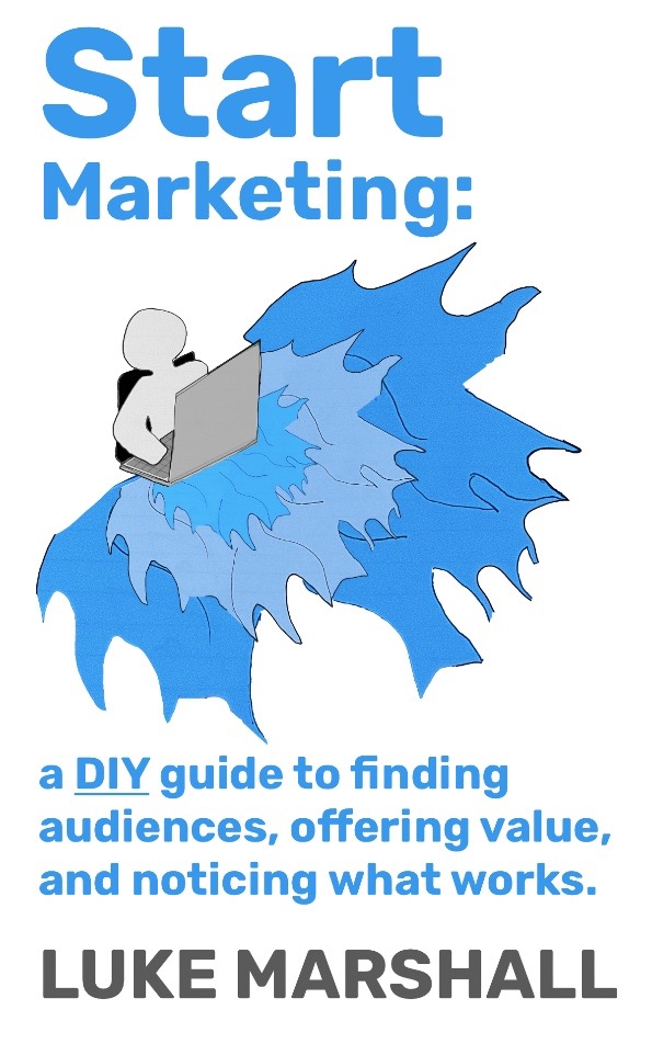
I’m keen to deviate from my website look and feel, so with a tool called ColorMagic I was able to grab a palette I can work with to build the cover out further.
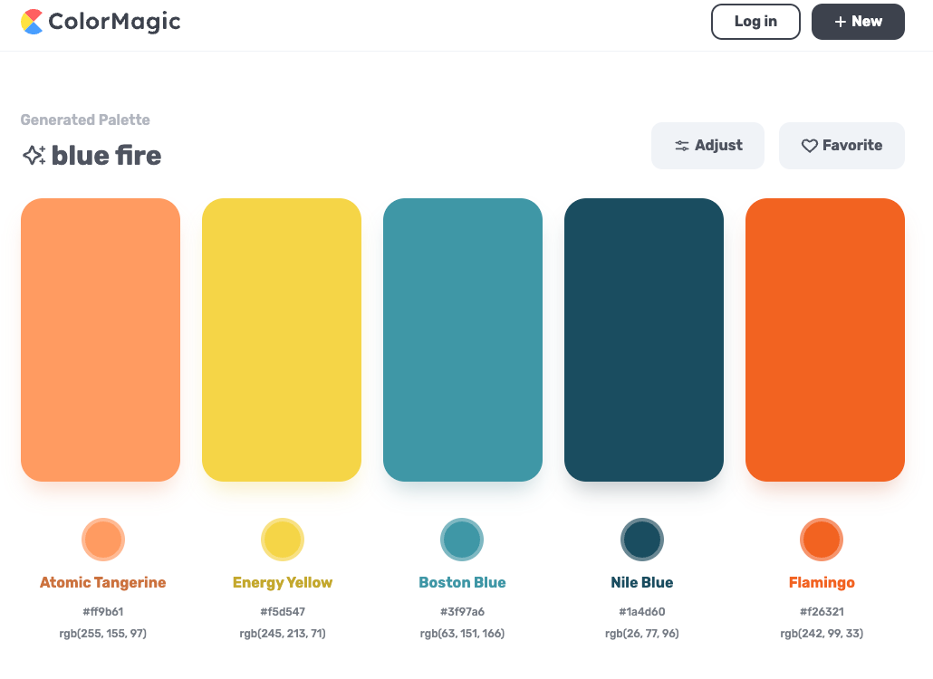
What you’re looking to do with your mini-brand book is have a simple text file or slide that has saved the key parts of design information all in one place.
Related chapters
What did you think?
Tell me what landed, what didn't, or what's missing.
Give feedback on LinkedIn →