
Offer · Chapter 64 · 3 min read
Remember CRAP
What’s scary is that, in order to write (or paint or compose or shoot film), we have two choices:
- We can work from our ego-minds, in which case we will burst blood vessels and suffer cerebral hernias, only to produce tedious, mediocre, derivative crap.
- We can shift our platform of effort from our conscious mind to our unconscious.
Which one do you think we’re most terrified of?
- Steven Pressfield, The Artist’s Journey: The Wake of the Hero’s Journey and the Lifelong Pursuit of Meaning
Through out this book, you’re being equipped with shortcuts for understanding concepts you could spend an entire career on.
There’s much more than CRAP if you’re a designer, but at least remembering it helps your creations get closer to “not shit”.
CRAP stands for Contrast, Repetition, Alignment, and Proximity.
Contrast is your colour and shading selection. It should be dark on light, light on dark, and corresponding colours that complement, rather than clash.
Repetition is repeating a technique, look, positioning, or styling to make it look consistent. An extreme example is McDonald’s. The fast food restaurant will try many new things but it will always be a yellow arch. Repetition also enables you to play with styling. If you want to add some flair at the bottom of your page do so. But make sure it’s on every page, or that the use of the flair follows a pattern or rule. It might be every second paragraph, it might be every time colour is used. Over time you’ll figure out what works and what doesn’t and if doubt, leave it out.
Alignment does a lot of heavy lifting for your page without a lot of effort. It simply means lining up the copy, sections, and visuals in some sort of line. You can have all starting words align on the left, on the right, or have it run down the centre. Landing pages (the pages you arrive at from clicking an ad) are a good way to see this in action. You’ll notice there’s a neat symmetry to the way things are positioned, and if something breaks alignment it’s for styling reasons or you’re looking at a non-designed page.
Proximity is the white space between words, visuals, and sections. Most pages benefit from a lot of white space. There’s a symmetry to it as well. A poorly designed page will ignore proximity and look cluttered. A well designed one makes it look like it was always meant to look this way.
Here’s how it works with the book cover:
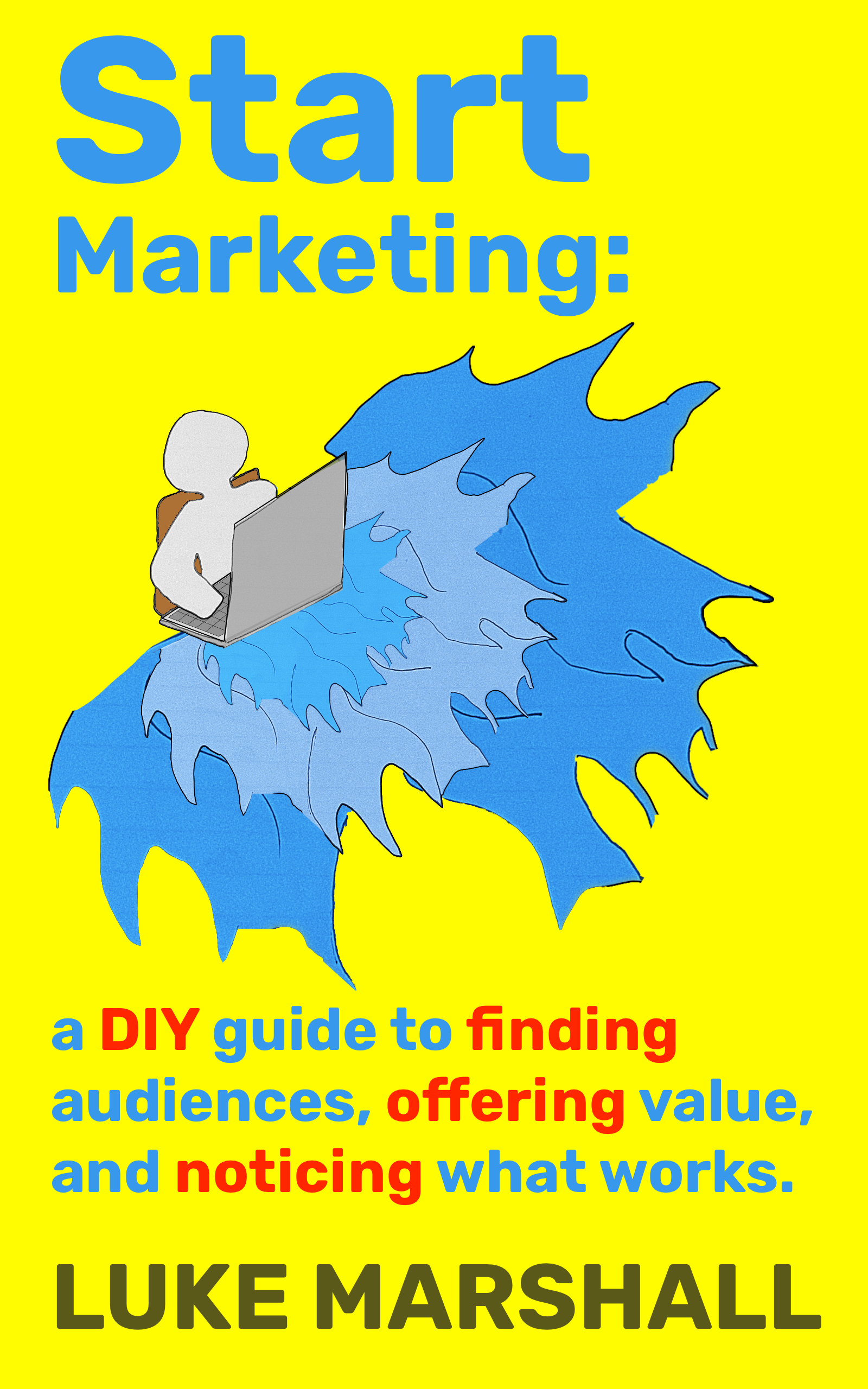
The contrast here is blue, red, and dark grey on yellow it helps the words, image, and emphasis stand out against the background (I understand most of you will see this in shades of grey if reading from an eReader).
I’ve repeated the red emphasis on words that I want to stand out do-it-yourself, finding, offering, and noticing all related to the core concepts.
You should notice that start, marketing, a, audiences, and, Luke are all aligned to the left it might be a bit harder to see, but the image is also aligned with the words on the very edge.
Proximity is around the image diagonal space either side from the left to the bottom. There’s an even amount of space around my name. The spacing between the image and the words is also even this “neatness” is easy to achieve with most image editors and presentation builders.
Most tools take care of most of this automatically for you. Find a style, tool and method you like and keep building.
Related chapters
What did you think?
Tell me what landed, what didn't, or what's missing.
Give feedback on LinkedIn →