Offer · Chapter 63 · 5 min read
Visual hierarchy
“Based on this first – visual – impression, a user will either stay and enter the shop and explore, or leave and take a look into your competitor’s shop window.”
- Chris Herbert, How to optimise your landing pages for Google Ads campaigns
Every offer you make has a certain order.
We use this term to explain what’s most important, what’s next most important, and what’s extraneous detail.
When we’re putting together offers, we can use visual styling to highlight what’s more important and what’s less.
So let’s share some common elements of an offer, and then break it down further for you with examples.
Note: I’ll refer to the offer as if it’s on a page, but this could be a screen, a space, social ad, or something else the important part is understanding the elements so that you can build your own.
Headline.
This is almost always the most important visual. The headline tells you what’s happening, attracts your attention, or adds to detail to why that eye-catching visual is so important to you. It needs to look bold and impactful. There’s many ways to achieve this size and emphasis are obvious ones. Fonts and colours are others. You can also play with the alignment, position, and how it contrasts with everything else on your page.
Call-to-action.
A CTA is what you want someone to do. It’s a closer. The headline appears to capture attention, and if the CTA is delivered and positioned well it gets the reader to take the next step in your sales process, which could be as simple as buying now, or as convoluted as asking for a discovery call. A CTA can be next to the headline as the next most important thing, or at the end of the page to finish things off.
Button.
With most pages you can style your button and make it stand out. It will feature 1-3 words and contrast with the rest of the page. It should be close to the CTA or the CTA should be repeated where the button goes.
Hero image.
Most offers are accompanied by a lead visual that complements the rest of the page. This is usually a striking picture or video with front-loaded action to capture your attention. A weird thing I love to do is to flip through international flight magazines and check out the ads. My favourites are the expensive watch ads. They’ll often have a photo of a person that simply emanates status. Royal blue clothing, appearing casual but actually anything but, and severe geometry and angles. The amount of planning that goes into such a shot to have the desired impact is next-level.
It’s near-impossible to achieve the same yourself, and we’ll talk about pictures in a chapter soon.
Social proof.
This element shows you know what you’re doing, you’ve done it before, and can do it for your reader. Testimonial quotes are used often here because they work. Logos, review snippets, or an ever-growing number all work well too. If you’re older you would have noticed “As seen on TV” growing up which is a credibility marker that no longer works. The modern equivalent online is media logos like Forbes, Mashable, and any other number of online publications.
Copy.
These are the words that fill in the gaps and build on what the headline is promising. Copy can contain headings, bullet points, styling, and adds the details. Visually there’s usually less room for play compared to the other elements. The copy needs to fit in and around them, and should follow the styling your website or other channel requires. A reminder to try and do things in threes.
Sh*t you should get rid of.
Anything that’s not the above. It’s great you’ve got other links, want to point to your social page, or give a shout-out to Holly. An offer page always has a singular CTA in order to get someone to do something. Adding anything else dilutes its effectiveness and confuses the reader.
As you grow your skills online, you’ll notice that it’s really hard to get anyone to do anything. It takes a lot of work to line someone up into even reading your offer, so when extra choices are introduced, it kills the chances of people doing more.
Here’s some examples that illustrate what I’m talking about.
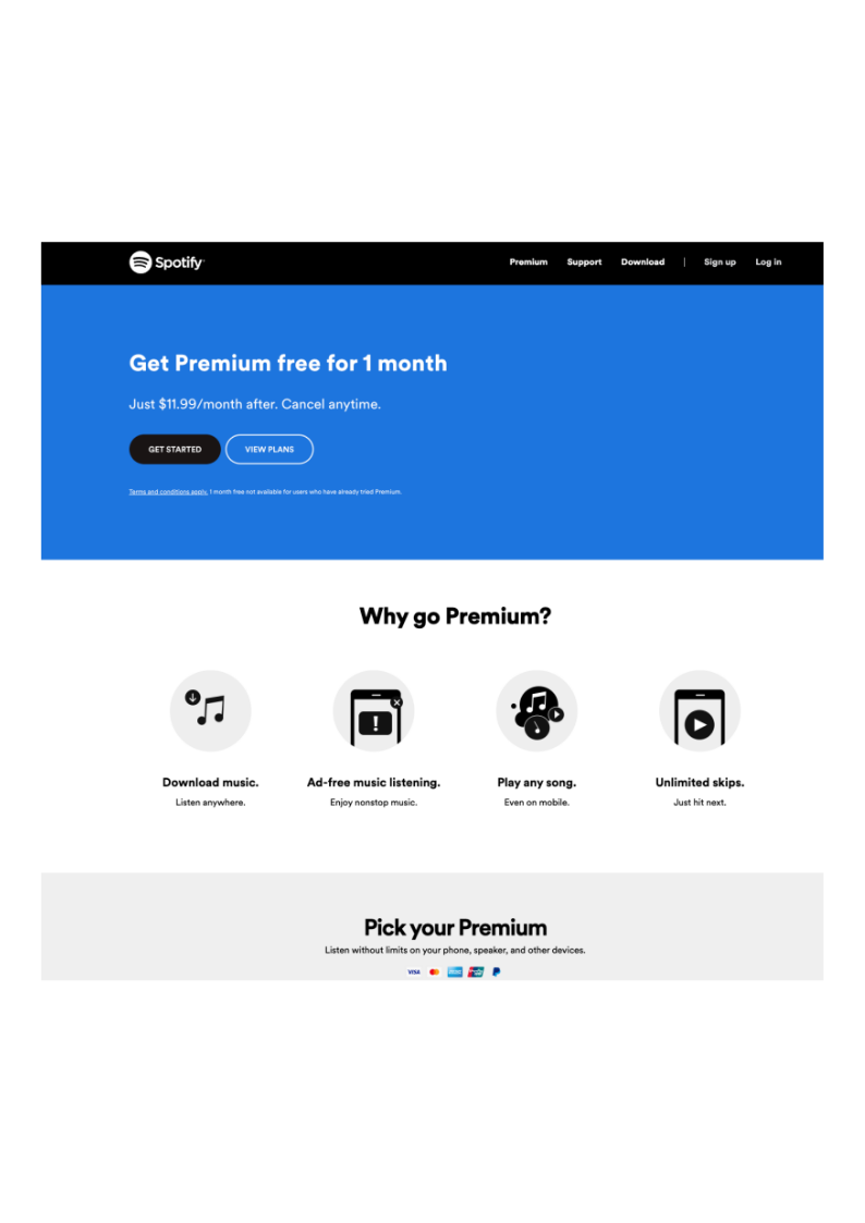
Example 1 - Spotify Sign-up Page
Headline.
Get Premium free for 1 month
Call-to-action.
GET STARTED (on the Button and capitalised)
Hero image.
Quite minimalist here, with icons corresponding with each feature/benefit.
Social proof.
It’s one of the most well-known online brands in the world, so doesn’t really need it here. You could argue the payment icons at the bottom qualify a little, as they’re illustrating that we accept ways to pay that YOU have.
Copy.
They’re doing a lot with very few words. There’s risk-reversal right after the headline. Four features that include benefits with the minimum amount of words. All of it is adding detail towards why you should follow the CTA and not a word more.
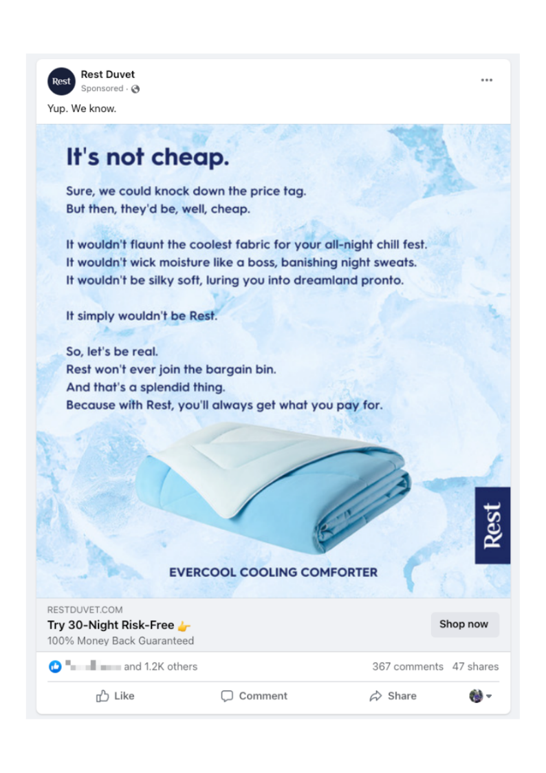
Example 2 - Rest Duvet Facebook Ad
Headline.
It’s not cheap.
Call-to-action.
Try 30-Night Risk-Free 👉
Button.
Shop now (you can only pick from limited options on Facebook ads).
Hero image.
Picture of the product, very minimalist but that complements the bare bones but bold messaging they’re going with.
Social proof.
Facebook has it built into their ads here. Interestingly one of my friends has liked this particular ad and I’m curious to know why!
Copy.
The copy is added to the image here, which is unusual for a social ad. Normally this would sit above the image, or have more detail on the page being clicked through to but it must work for this brand. The risk-reversal is built into the CTA too.
Once you start seeing the hierarchy, it’s hard not to see it. It shows you where things need to go to “make sense” and when they’re not in the right spots it’s jarring without being able to say exactly why.
Visual hierarchy is like a pleasant guest at a dinner party - a necessary ingredient but not the main meal.
Related chapters
What did you think?
Tell me what landed, what didn't, or what's missing.
Give feedback on LinkedIn →